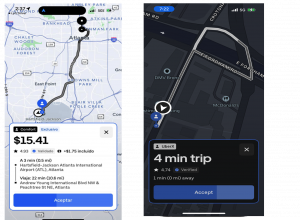
For many full-time Uber drivers in New York, the flexibility to set schedules and choose routes is essential. However, Uber’s approach to sharing trip information in New York City limits that freedom by restricting details available to drivers before they accept a trip. Unlike in other states, where Uber offers crucial information like the trip’s destination and estimated fare, New York drivers must decide with only minimal data. This setup can make it difficult to plan, disrupts schedules, and in many cases, feels restrictive to drivers who want the autonomy to decide when and where to work.
Challenges of the Current Trip Information Window:
One key issue in New York’s Uber app is the limited information in the Trip Information Window, which includes only minimal trip details. While other states provide more transparent details, New York drivers see only the basics. There’s no indication of the destination, county, or estimated earnings—forcing drivers to make quick decisions on trips with potential financial and time repercussions.
Another challenge is that the Trip Information Window only remains open for a few seconds, which can result in hurried choices. Additionally, Uber’s policy that limits drivers’ ability to reject trips without consequences often pressures them to accept trips without adequate time to assess their suitability. Further complicating matters is the small font used in the window, making it hard to read important trip details like “UberX” or the estimated trip time. This combination creates a frustrating experience for drivers who rely on informed decision-making to manage their schedules.
Comparisons with Other States:
It’s worth noting that in other U.S. states, Uber provides drivers with full visibility of the trip details. This includes the trip destination, fare estimate, and sometimes even the trip’s estimated length. This extra information allows drivers in these regions to make more informed decisions, optimizing their routes and time on the platform.

NEW YOKR vs OTHER STATES
Proposed Solutions to Improve the Trip Information Window:
- Increase Information Displayed: Uber could enhance the Trip Information Window to show key details such as the county, estimated fare, and destination. This would empower drivers to make better decisions in real-time.
- Extend Decision Time: Allowing drivers a longer timeframe to assess trips before they accept them would help prevent rushed decisions. A minimum of 10 seconds could offer enough time for drivers to analyze the information provided.
- Adjust Font Size: The text in the Trip Information Window is often too small, particularly for details like “UberX” and estimated trip duration. Increasing the font size would improve readability, ensuring drivers can quickly view all relevant details.
- Provide Flexibility on Trip Acceptance: Uber could reevaluate its policy on rejecting trips without penalty. Given that New York’s app setup limits transparency, drivers should have more leeway to reject trips that don’t align with their work preferences or location.
By addressing these aspects, Uber could improve driver satisfaction and allow for a more balanced and flexible driving experience in New York City. Transparent information empowers drivers, ultimately enhancing the efficiency and quality of Uber’s service.


